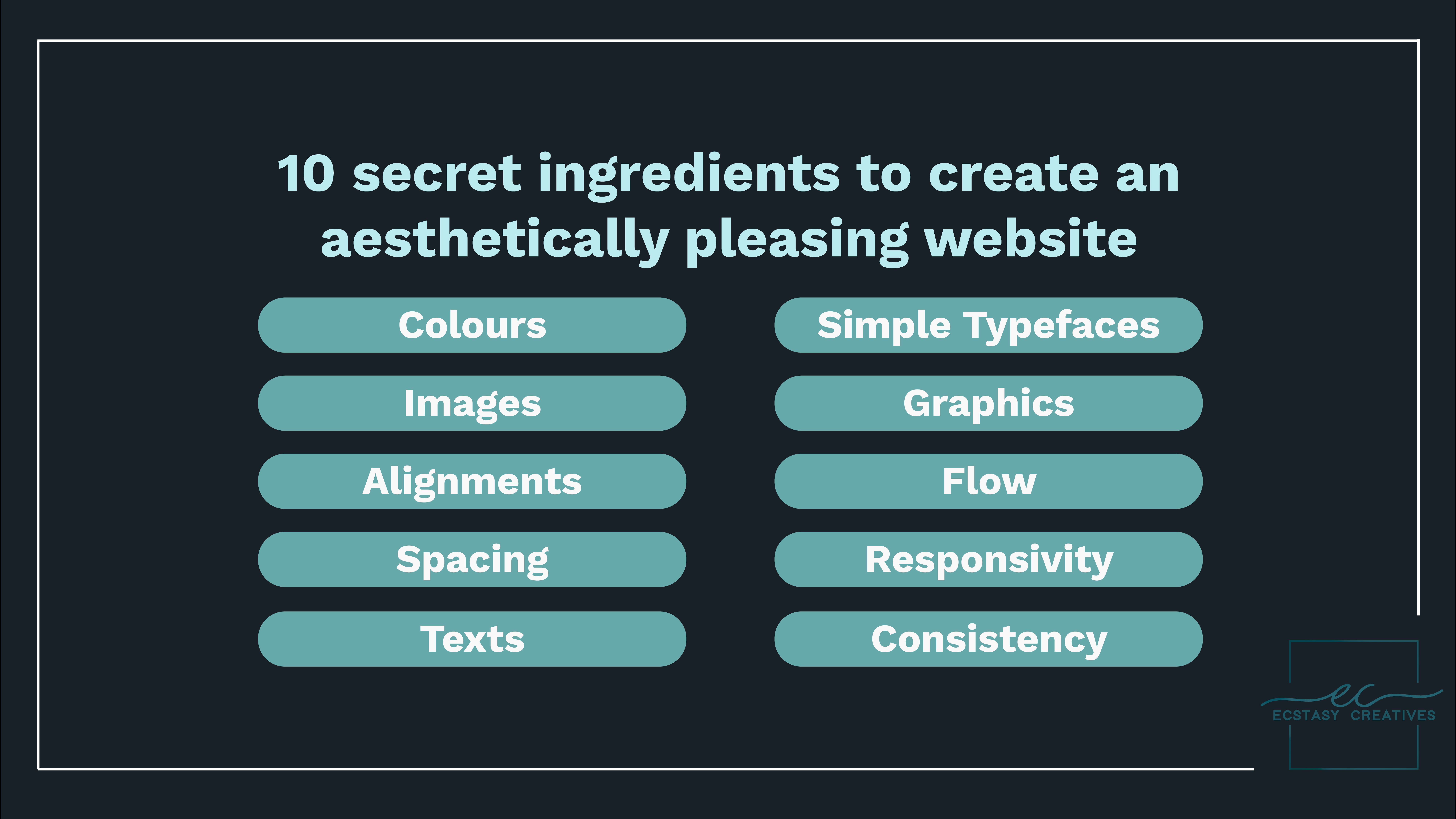
10 secret ingredients to create an aesthetically pleasing website
A website should look aesthetically pleasing in order to attract an audience. So what is an aesthetic website? A visually appealing website is more functional and inviting. It helps in gaining the user's attention in the crucial first 30 seconds where users need to be engaged to continue using our website. The aesthetic effects must support the content and must be created so as to reach the target audience. Given below are the 10 secret ingredients that can help you to create aesthetically pleasing websites.
Colour:
This places a major role in seeking attention from the users. According to the colour theory, the use of blue colour gives a calming effect and the use of orange or red colour gives a warm effect that commands attention. The colours and the colour combinations must be taken care of so as to make the most attractive palette for your target audience.
Images:
One of the most powerful and visually appealing tools is the use of images on a website. A picture is worth a thousand words. Add relevant photographs, illustrations, or diagrams, as per your website content.
Alignment:
A page that is chaotic will only have a higher bounce rate. Rather make a simple and balanced website that should not look crowded. The elements of the website should be spaced with proper alignment.
Space:
Leaving space might make the page look blank but it is a part of an aesthetic website. If the website is frenetic the users might get deviated from the actual content. This is where spaces are used. It is like a break in a busy day!
Texts:
Use headings and subheadings with different text size to ensure easy visual scanning for your users. Make sure you bold and/or underline the most important points. The colour of the texts should contrast with the background. You could also use anchors to link pages in order to communicate important concepts with the ease of a click!
Simple typeface:
The typeface that you would be using for your website should not be too artsy or too minimal. It is highly recommended for you to use a maximum of three different typefaces in a maximum of three different sizes.
Graphics:
The use of graphics should be as per the requirement. Only use graphics if they help the user to complete a task and do not use it just to fill up the empty spaces. Again, spaces are the new aesthetic!
Flow:
Keep the structure of your website simple and easy for your users to navigate through your site by providing them with search functions, navigation buttons, footer navigation links, etc.
Responsive:
Your website must be compatible with many different types of devices and brands that your audience might use. This type of design is known as responsive design. Responsive design means investing in a highly flexible website structure. On a responsive site, content is automatically resized and reshuffled to fit the dimensions of the various kinds of devices that the user might use. This can be accomplished with mobile-friendly HTML templates, etc.
Consistency:
Lastly, to keep the navigation or the flow of your website smooth, the overall feel of your website shouldn’t be abrupt. Keep it simple and stick to one theme. The background colour/pattern, colour palette, texts, and even your tone of writing should be consistent. All these together have a positive impact on the usability and the UX of your website.
We, at Ecstasy Creatives, add flavors to your business pleasantly!

